Sunday, May 12, 2013

Vector Text Effect

Blogging assignment #5

Here I am again doing the text effect but this is more challenging than the ones I have done in the Adobe Photoshop. Illustrator for me is much complex  to use. Though I have fun doing it with the occasional frustrations on tools but I enjoyed doing this.

 This one is the gummy text effect this looks so simple but I have taken much time to carefully do the effects. I got its tutorial in this link: http://vector.tutsplus.com/tutorials/text-effects/quick-tip-how-to-create-a-gummy-text-effect/.  Well the tool mainly here is using the pathfinder,the clipping mask and the appearance panel. First I have to get the tidal font then type the words I wanted then I went to object to expand option, to make into a shape. Then I duplicate it many times, subtract it. The thing I did to not    damage the original text was to lock its path though it tiring for me to turn it of and on  but It will help you not to go frustrated in ruining the original text. I could save you from doing the whole thing all over again.

This one is my favorite because its cute and I like the heart above the eye and the crown I made. Though I did it all over again because the first time I tried it I was frustrated. So I rest a day and did the first one above this text the gummy text which helped me a lot because I discovered some tools that I have to use is like the gummy text well in fact the cake frosting text was to be done first than the gummy text so that I wouldn't have the hard time doing the gummy text but I think my brain works a little different I started on the hard effect rather than the easy one. The tools that I use are heart breaker font, the pathfinder, appearance menu. Just like the gummy effect first I have to expand the text then duplicate, occasionally subtract the shape in the pathfinder menu to create a 3D like effect then add blur effects until you finish the whole tutorial.

The things I learned were to patiently read the instruction and not just to look at the picture on the tutorials because sometimes there are instructions that are not mentioned in the pictures of the tutorials.I learned how to useful the lock path option when doing text effects. You have to understand the instructions well, don't argue with the instructions as if you know how to use the program expertly.It could save you fro frustrations on unsatisfied works. 

Ciao~ Untill next time ^.^

Logo Design

Blogging Assignment #4

Logo Design

 Our professor gave us the task to do 3 logo designs. However I found myself dried up of  all those "artistic juices" as our prof likes to call our creativity. It was like I was sitting in my desk starring at my blank sketchpad for hours just to make my brain work to give me some interesting designs. So I researched the things that I want, things that catches my interest.

So I came to have these 3 logo studies. First I have to sketch them.


 These logo studies is for a digital producer company, since I like arts, movies and animations, I decided to create logos like this. The first one fro the left is some shapes forming "i P" the initials of my name. It is a brand mark logo. The Second one is a word mark logo for Iris Palivino works. Lastly the third one for a combination mark logo. After I sketched these studies, I proceeded to line art and color these logos in Adobe Illustrator.

Since I'm not used in using Adobe Illustrator, I had a little hard time doing the line art. I tend to get confused which is which and where is the tools that I need. But somehow I manage to do it.

These are the results.


This one is a little not so clear, I hesitated in moving the circle further to create a P which I totally regret it now. I came up with this by having four rectangle shapes, three vertical ones, one horizontal,a square and two circles. First I arrange the shapes in forming the letter I, and the line for P then I went to windows>pathfinder>then click the add option, in the arc of the letter P, I added two circles over each other then clicked the subtract button in the pathfinder menu. 

 This one is my personal favorite. Because I love the cursive style of writing ever since. I decided to make a signature like word mark. First I sketched it, then I layout it using the pen tool then I explored whatever stroke the pen tool offered. I had fun doing this unlike the other two logos.


This one is pretty much hard to do, First I trace the eye like drawing then, next thing I did was to trace the sunrise like eye pupils since my name is Iris like one of the part of the eye then next thing was the hardest was doing the rays of the sun like aligning it, scaling it until it looks like the rays of the sun. I took me an hour to do that and it frustrated me to no end by the time I have work with the silhouette i found myself dried out again of the artistic juices and didn't pay attention to details, lastly the words in the logo was bit frustrating the wrap was not write and the font needs to improve. Looks like I need to practice how to choose fonts and wrap text.  

What I  learned in doing this activity is that patience is a virtue as a doing logo needs a lot of patience for a logo to be presentable if not above others. You should have a clear thought of what you want to express because it will reflect in your logo. A logo that reflects what the owner or the company wants to express is a successful logo. next one is the most important if those creativeness runs out take a break and look for something that inspires you or just rest your body and brain from thinking and doing the task because it you continue doing the task with resentment and frustration the outcome will be not so pleasing that you will regret it what the outcome looks like. Well Practice makes perfect that's is why I need to practice to improve my skills on this department of doing logos and using Ai.


Ciao, Until next time~

Friday, May 3, 2013

http://www.adobetutorialz.com/articles/2884/1/Business-Web-Page

Blogging Assignment #3

This is my web page design that I created using the link below. Well first of all, I thought there are some special programs that created webpage and solely for web pages only. But I have discovered it was just by the use of Adobe Photoshop and Illustrator.

making the layout was hard at first, you need to get right measurements which took my time mostly because I didn't know where to refer to make those right measurements. I wanted to add a little more like a image slide show to make it more personal, but I hesitated because it will go out the original design. I wanted to create a mixture of the tutorials presented but with so little time and other circumstances mainly blackouts, I did not do it.


The things that I have learned were quite many, the entire design of the layout depends on how you use the layers styles on Photoshop. 3D effects can be made by gradient tool, I was quite surprised by it. you need to know the uses of each layer styles to effectively use the but the most important thing that I have learned is that one was have creativeness and not just copy the tutorials that is provided, you have to explore.

My insights for this activity was, making a layout is time and energy consuming. You have to carefully think of the details fit for your layout. It was tiring making one by one modification, scaling them, arranging their colors, putting patterns, but I think it was worth it. The soreness of my shoulders was worth it when I learned new things like this, it clears my misunderstanding that all of things such as creating a layout is not possible without having complicated programs what you need is your imagination, patience, and perseverance to finish your layout.


Friday, April 26, 2013


Text Effects

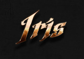
http://psd.tutsplus.com/tutorials/text-effects-tutorials/metallic-copper-text-effect/
This Text effect was my output assignment. We were given the task to find tutorials on text effect . In this site: http://psd.tutsplus.com/category/tutorials/

Well Its a very helpful site :D 
User friendly and easy to use. Well first of all, of course I go to the site and choose the text effect I want then viola! Instructions are there.  The materials I need were, the concrete texture that I search in Mr. Google for the pic the tutorial provided is not downloadable.  Argel font and Palace balls. Its not pretty hard to do, well alone without these tutorials can be fatal, on your brain cells that is, but this one is just purely used of Layer styles in which I never thought that this Layers styles can be much powerful tool than used I to think, well I've taken for granted in using Layers styles but after doing these tutorials made me see that the text we see in movies and websites was actually created by creatively using layer styles.
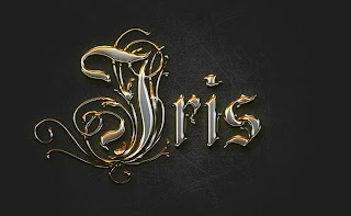
http://psd.tutsplus.com/tutorials/text-effects-tutorials/crisp-metallic-text-effect/

Well this one is my personal favorite. I love the old writings with artistic lines, vines and all. I really like this because it made my name look regal (ahahaha!). The materials I  needed were the subtle grudge brush and Rothenburg decorative font. In this text I discovered the perks on the option of Invert. Gosh It was really fun, its like at first when I used the Invert option my visible brush strokes was gone! I panicked and read the instruction over again, and even argued on the process, but it the end when I followed the "brush over lighter color to the layer then it appeared, and I was like "Woahhhh, Awesome!" Another thing is the 3D like, it all takes a good gradient combination, right bevel and emboss, texture and viola it makes an optical illusion.
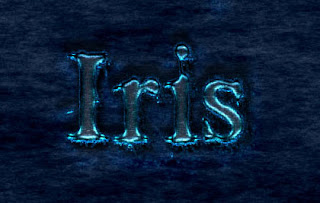
http://psd.tutsplus.com/tutorials/text-effects-tutorials/scary-text-effect/

This one is well, I enjoyed it, the materials I needed was the font Times New yorker, dark  and rock patterns. This one needs patters to make the effects with the help of Layer styles it creates a watery luminous effect to be scary.


Well after all the tutorials, one I learned to use the Invert option, as I explained earlier, the use of different patterns and the advantage of bevel and emboss, In short I learned to use the Layer Styles more than before, it taught me to be more creative and to play around the options that are presented in  the Layer styles. It will really help me to improve my skills in using adobe in a more productive way.

Thursday, April 18, 2013

#1: Reflection


Multimedia is an inseparable part of our daily lives and activities. Multimedia is made to make our lives a lot easier than before. It empowers our intelligence and creativity.  It makes our task lighter and easier to manage, like typing our documents, printing them in an instant; it updates us on the current events happening in the world by watching television news, it helps us connect to people across the world, it helps us ease the longing for our loves ones abroad, it helps us build friendship to other people from other country, it helps us know the different cultures in other countries it is like showing us a whole new world to appreciate. Multimedia has many things that could help us, after all it was made for the benefit of humankind (and the list can go on to fill this blog, so let cut this short).

As an Information Technology (IT) student, an enjoyable course with a little hint of hellish brain cracking programming moments , I came to a conclusion that multimedia is essential. Especially in my course, we manipulate this multimedia to create a new and unique program or thing  for the purpose of entertainment like editing funny pictures, creating animation and arts, but not only in the department of entertainment  we are using this, it is also widely used in gathering and giving information which is very important to us. It provides us information, for us to use like weather reports, latest trends, new discoveries, travel tours, and video tutorials (which I always use, and these helps me a lot).


Multimedia is part of my career whether I like it or not (of course I do like it!) in the future. Because my course often deals with manipulating multimedia to create things that could empower humankind more to its fullest, it is a powerful tool for us to be able to reach our goals, or in other words it is also a useful tool for success in any form. 


Wednesday, April 17, 2013

This Blog is for  my ITMM course this Summer  :)))

A little nonsense post!
Here have my fave song <3

" Houkago Stride"

by Gumi