Text Effects
 |
| http://psd.tutsplus.com/tutorials/text-effects-tutorials/metallic-copper-text-effect/ |
Well Its a very helpful site :D
User friendly and easy to use. Well first of all, of course I go to the site and choose the text effect I want then viola! Instructions are there. The materials I need were, the concrete texture that I search in Mr. Google for the pic the tutorial provided is not downloadable. Argel font and Palace balls. Its not pretty hard to do, well alone without these tutorials can be fatal, on your brain cells that is, but this one is just purely used of Layer styles in which I never thought that this Layers styles can be much powerful tool than used I to think, well I've taken for granted in using Layers styles but after doing these tutorials made me see that the text we see in movies and websites was actually created by creatively using layer styles.
 |
| http://psd.tutsplus.com/tutorials/text-effects-tutorials/crisp-metallic-text-effect/ |
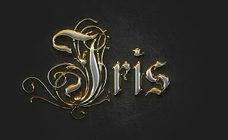
Well this one is my personal favorite. I love the old writings with artistic lines, vines and all. I really like this because it made my name look regal (ahahaha!). The materials I needed were the subtle grudge brush and Rothenburg decorative font. In this text I discovered the perks on the option of Invert. Gosh It was really fun, its like at first when I used the Invert option my visible brush strokes was gone! I panicked and read the instruction over again, and even argued on the process, but it the end when I followed the "brush over lighter color to the layer then it appeared, and I was like "Woahhhh, Awesome!" Another thing is the 3D like, it all takes a good gradient combination, right bevel and emboss, texture and viola it makes an optical illusion.
 |
| http://psd.tutsplus.com/tutorials/text-effects-tutorials/scary-text-effect/ |
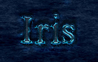
This one is well, I enjoyed it, the materials I needed was the font Times New yorker, dark and rock patterns. This one needs patters to make the effects with the help of Layer styles it creates a watery luminous effect to be scary.
Well after all the tutorials, one I learned to use the Invert option, as I explained earlier, the use of different patterns and the advantage of bevel and emboss, In short I learned to use the Layer Styles more than before, it taught me to be more creative and to play around the options that are presented in the Layer styles. It will really help me to improve my skills in using adobe in a more productive way.
Well after all the tutorials, one I learned to use the Invert option, as I explained earlier, the use of different patterns and the advantage of bevel and emboss, In short I learned to use the Layer Styles more than before, it taught me to be more creative and to play around the options that are presented in the Layer styles. It will really help me to improve my skills in using adobe in a more productive way.
No comments:
Post a Comment